Transforming the online gaming transaction experience
Impact
Enhanced user engagement and satisfaction through improved usability and intuitive design.
Decreased support inquiries by streamlining workflows and reducing friction points.
Enhanced deposit and withdrawal processes, making transactions smoother and more efficient.
Role
- User research & analysis
- Stakeholder interviews
- Component creation
- Design system updates
- Usability testing
Timeline
- 3X2 weeks sprints
Tools
- Sketch
- Zeplin
- Abstract
- Whimsical
- Usertesting.com
- BootstrapVue
- Material Icons
- Jira
Problem statement
Bingocams’ community members experienced challenges in obtaining a clear, organized overview of their transactions. Although the transaction processes themselves were functional, a lack of clear information led to user confusion, increased customer support inquiries, and, potentially, member loss.
Process
This project followed a user-centered design process, outlined below—from initial discovery to final design solutions.

Problem discovery
To better understand the current challenges, I conducted stakeholder interviews and reviewed existing insights provided by the customer success team. This helped surface key user concerns and areas of friction.
To uncover hidden pain points and validate internal feedback, I conducted usability tests with ten users—five new and five returning—focusing on core actions such as deposits, withdrawals, and overall navigation within the existing interface.
Analysis
I performed competitor analysis to benchmark industry standards and identify potential opportunities for improvement.
After gathering insights from stakeholder interviews, customer support data, competitor research, and usability testing, I synthesized the findings to identify patterns and recurring pain points across the user journey.

Ideation
Proposed solution: To address the identified challenges, I proposed a comprehensive redesign of the transaction overview page. The goal was to create a more intuitive, organised, and accessible experience that would enable users to confidently track their financial activity with minimal friction. The new design aimed to reduce cognitive load while supporting independent navigation and discovery.
Wireframing & concept exploration: I began by sketching and prototyping several wireframe variations for the transaction overview page, focusing on layout structure, content hierarchy, and mobile responsiveness. These wireframes served as the foundation for early user testing and feedback sessions.

High-fidelity design
Based on early wireframe testing, I created high-fidelity mockups that reflected users’ preference for a simple layout over advanced features like filtering—especially among less tech-savvy users.
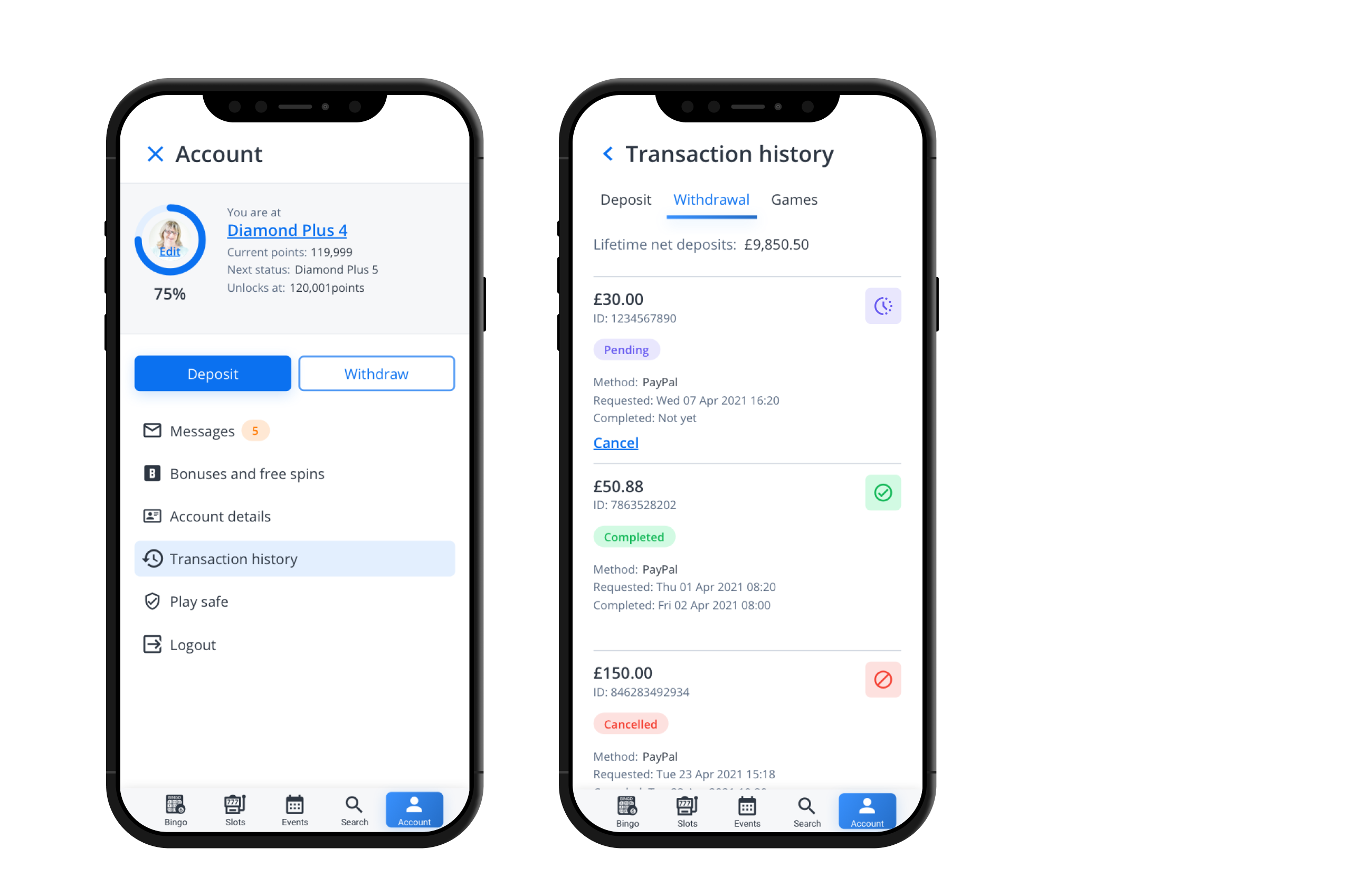
Following our mobile-first approach, we chose a clean grid layout over a table view, as it tested better for scannability and adaptability across devices—making it ideal for the MVP.
The final design was shaped by user feedback and validated through testing, ensuring alignment with both user needs and business goals. I then created responsive high-fidelity prototypes, emphasizing transaction status and clear labeling, covering all breakpoints for a seamless experience across devices.

Error handeling and empty states
I designed mockups for error states, empty states, and other edge cases, ensuring a clear and consistent user experience. I collaborated closely with the development team to ensure these scenarios were seamlessly integrated into the final design.

Testing
With a near-final version of the design, I conducted usability tests to gather valuable user feedback and refine the high-fidelity prototypes. Key insights are outlined below and were incorporated into the final MVP, contributing to its successful launch.
Allowing users to save payment methods enhances convenience and satisfaction.
Toast messages are effective for confirming successful transactions, as they provide quick, non-intrusive feedback. However, for error states or failed transactions, dialog boxes are better suited, as they ensure the user notices and takes necessary action.
Design system
To ensure consistency, I designed the transaction card components for the shared library and created detailed guidelines to support development and QA teams.

But UX is never done…
This project was completed four years ago, and looking back, here are a few areas I’d love to improve today:
Measure system usability with a usability scale.
Test for accessibility across different devices and user groups.
Improve micro-interactions, especially during loading states.
Conduct more frequent usability testing throughout the product lifecycle.
Enhance assisted onboarding to help all users quickly understand the updated transaction processes.